Project Showcase: QCFlows
Paulo Itaboraí, Iosifina Angelidi, and Kostas Blekos built a live dashboard that renders a quantum circuit as a dynamic graph, so you can watch correlation and entanglement structures form and move across the layers of an algorithm.
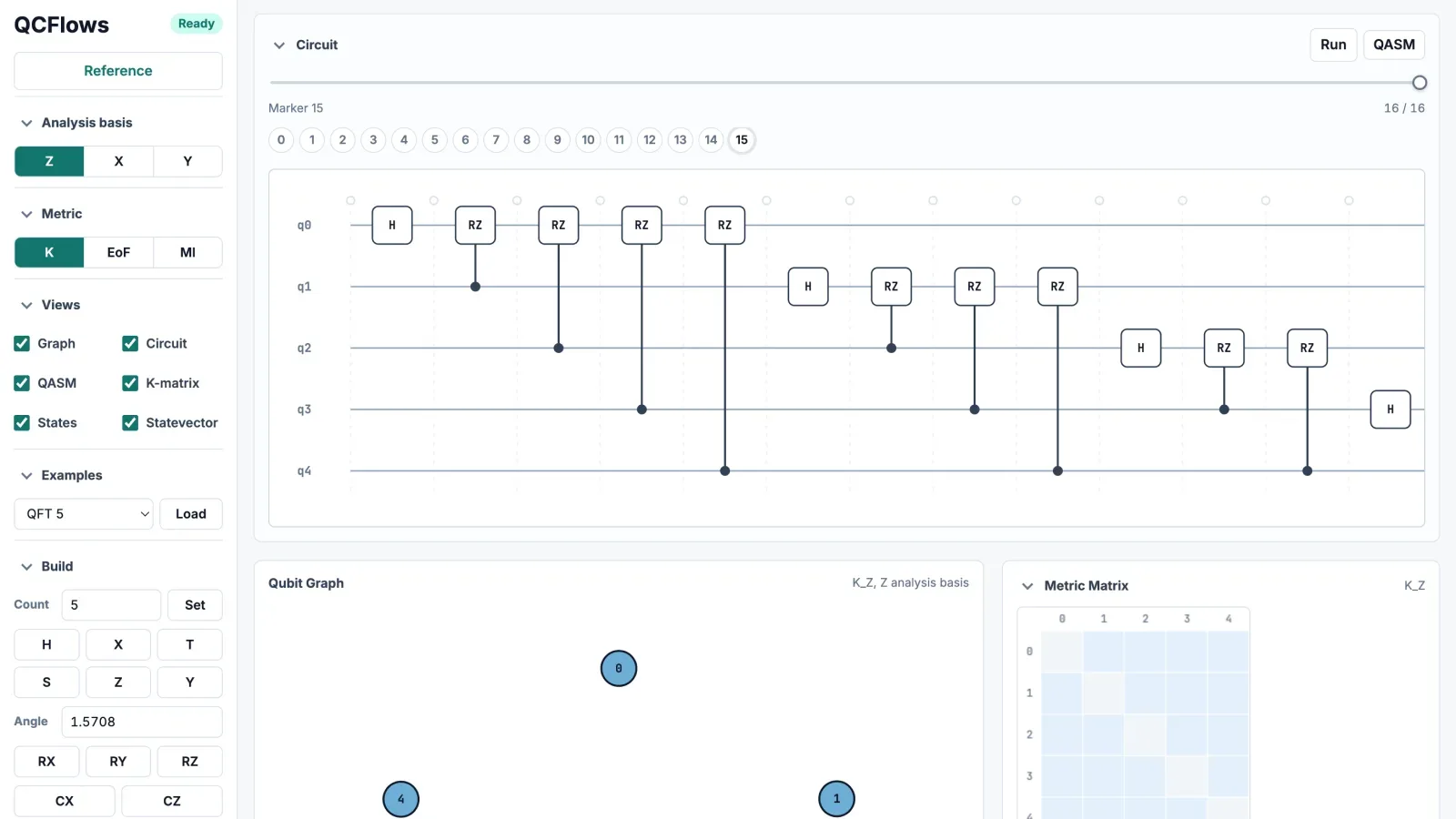
A circuit diagram shows you the gates but nothing about the thing that makes the circuit quantum: the web of correlations that forms, shifts, and spreads between qubits as the state evolves.
QCFlows makes that web visible. Draw a circuit onto an interactive qubit graph, or import your QASM, and a live dashboard renders the correlation structure as a dynamic network you can scrub through, layer by layer. It runs in the browser at app.qcflows.net, and the whole stack is open source.
We keep coming back to how difficult it actually is to visualize entanglement. The project is based on quantum tomography ideas, but those often stay on the academic side and don't get across to a general audience. We're trying to bring the visualization of correlations between qubits to a general audience.
Built by
Seeing past the gate diagram
Most circuit tools stop at a static, gate-by-gate layout. The correlation structure that builds up while those gates run is invisible in that view, and it is precisely the part that carries the quantum behavior.
QCFlows puts it on screen: an interactive qubit graph and a metric-matrix heatmap sit alongside a traditional wire view, all linked to the live statevector, so every gate you add or remove redraws the whole picture.
| Field | Detail |
|---|---|
| Qubit graph | The circuit drawn as a network; edges weight live pairwise correlations. |
| Metric matrix | A heatmap of every pair under the chosen metric and analysis basis. |
| Circuit timeline | Scrub through the gate sequence; every view follows in real time. |
| Statevector readout | The raw amplitudes behind the pictures. |
It is an idea that comes from all of us, on how to visualize the information flow in quantum circuits. We did some calculations, some preliminary graphs. The point, when we started this, was to get insight into how quantum algorithms work in the dynamic sense.
A direction for correlation
The dashboard's default lens is the team's own metric: the K-network, formalized in their June 2026 paper, “What does measuring one qubit reveal about another?”.
The K-network answers a question a symmetric weight cannot: if you measure qubit i in a given basis, how strongly does that outcome reshape the state of qubit j? The scoring engine behind it is compact enough to read in one sitting.
# How the backend scores a directed correlation, K[i->j], from a pair's
# reduced density matrix. Excerpt from qcflows_api/k_measure.py.
import numpy as np
from qiskit import QuantumCircuit
# A 4-qubit ladder: each CX hands correlation one qubit down the line.
CIRCUIT = QuantumCircuit(4)
CIRCUIT.ry(1.2, 0)
CIRCUIT.cx(0, 1)
CIRCUIT.ry(1.2, 1)
CIRCUIT.cx(1, 2)
CIRCUIT.ry(1.2, 2)
CIRCUIT.cx(2, 3)
def directional_k(rho2, zero_idx, one_idx, tol=1e-10):
"""K for measuring one qubit (Z basis) and inspecting the other."""
s0 = rho2[np.ix_(zero_idx, zero_idx)] # measured qubit read 0
s1 = rho2[np.ix_(one_idx, one_idx)] # measured qubit read 1
p0, p1 = np.real(np.trace(s0)), np.real(np.trace(s1))
if p0 < tol or p1 < tol:
return 0.0
value = 4.0 * p0 * p1 * (1.0 - squared_fidelity(s0 / p0, s1 / p1))?The K score. Read one qubit in the Z basis. K asks how distinguishable the other qubit's two conditional states become, weighted by how informative the readout was; the weight peaks at a 50/50 split. Zero means the measurement reveals nothing about the partner.
return float(np.clip(value, 0.0, 1.0))
def directed_pair_k(rho2):
"""(K[i->j], K[j->i]) from one 2-qubit reduced density matrix."""
k_ij = directional_k(rho2, [0, 1], [2, 3]) # measure i, inspect j?Direction matters. The two calls swap which qubit is measured. K[i→j] and K[j→i] can genuinely differ, which undirected metrics like mutual information cannot express.
k_ji = directional_k(rho2, [0, 2], [1, 3]) # measure j, inspect i
return k_ij, k_ji
# The flow: truncate the circuit after every gate and rescore every pair.
for m in range(len(CIRCUIT.data) + 1):
state = prefix_state(CIRCUIT, m) # statevector after the first m gates?The flow. Each marker is the circuit truncated after m gates. Rescoring at every marker turns a static diagram into motion: correlation appears at one CX, then gets handed down the line by the next.
print(f"marker {m}:\n{k_matrix(state).round(2)}")
The answer comes back directed. Ki→j and Kj→i can genuinely differ, so the qubit graph becomes a map with arrows rather than a symmetric mesh, while each score remains lightweight to compute. The QCFlows dashboard caches locally all computed metrics from the system, so that visualization and exploration can be done in real time.
| Field | Detail |
|---|---|
| K-network | The default: a directed, measurement-induced correlation score. Ki→j and Kj→i can differ. |
| Mutual information | Undirected total correlation, classical and quantum together. |
| Entanglement of formation | The entanglement on its own, separated from classical correlation. |
| Bases | Every metric viewable under Z, X, and Y measurement. |
From simulator to hardware
Where do the density matrices come from? On a simulator, straight from the statevector. On hardware, the same numbers arrive by pairwise quantum state tomography: run the circuit many times, each time measuring each pair in specific arrangements of the XYZ basis (ZZ, YY, ZX, ZY and so on), and reconstruct each pair's state from the statistics. QCFlows treats the two as interchangeable sources feeding the same dashboard.
The experiment the team most wants to run on IonQ is a full pairwise tomography of a cat-state preparation, based on the algorithm in Iosifina's paper. Done faithfully, it needs mid-circuit measurement, a capability IonQ has slated for its upcoming Tempo processor. Until then, the team has a fallback ready.
Otherwise, we run each layer of unitaries and measurements, save the output state, and refit it into the next layer until we get the cat state. That is what the algorithm in the paper does.
The team has since run that comparison on hardware. In August they prepared a ten-qubit GHZ state, where one Hadamard and a ladder of CNOTs put every qubit into a single shared correlated state. The same circuit then went through QCFlows three ways.
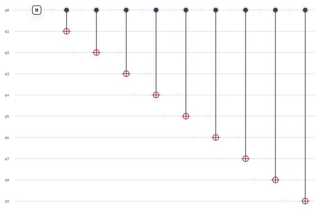
An exact statevector gives the answer with no noise in it. IonQ's simulator carrying the forte-1 noise model gives a prediction of what the machine should do to it. Then the machine itself, forte-enterprise-1 at 4,096 shots per job. For ten qubits the team needed 21 arrangements of circuit measurements to perform this tomography across all pairs, almost 90 thousand shots in total.
The same ten-qubit GHZ state, analyzed three ways in the Z basis.
| Run | Mean correlation | Strongest pair |
|---|---|---|
| QCFlows statevector | 1.0000 | 1.0000, at 0→1 |
| IonQ simulator, forte-1 noise model | 0.8515 | 0.9664, at 0→9 |
| Hardware, forte-enterprise-1 | 0.8690 | 0.9299, at 9→0 |
The statevector run is the reference: every pair maximally correlated, mean 1.0000. The noise model predicted correlation would fall to 0.8515. Hardware came back at 0.8690, above the 0.8515 its own noise model had forecast. That holds on the average, not pair by pair: on the strongest single pair the simulator predicted more correlation than the machine delivered, 0.9664 against 0.9299.
The noiseless run is perfectly symmetric, so direction has nothing to show. Once noise enters, the edges grow arrowheads and the two directions separate, which is why the noise model's strongest pair reads 0→9 and the hardware's reads 9→0. Both involve the two ends of the CNOT ladder, the qubits that hold their correlation best.
The library then went up a scale. On 17 August the first correlation matrix for a 36-qubit QAOA circuit came out of the same pipeline.
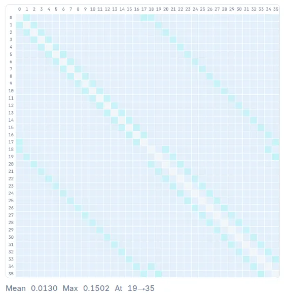
Mean correlation across all pairs sits at 0.0130, far below the GHZ state's near-total coupling, and that is what a QAOA ansatz should look like. The structure concentrates along the nearest-neighbour diagonal, with a handful of long-range pairs standing clear of it. The strongest reads 0.1502, between qubits 19 and 35.
Made to be taken apart
The architecture is deliberately modular: a backend that computes quantum-information metrics and a frontend that visualizes them, talking over HTTP requests, published as two separate repositories. You can run the full dashboard, or skip it and call the API from your own project, where every metric comes back as plain JSON.
If you just want to compute a mutual-information network metric, you should be able to take that part of the app and be happy about it.
The app lives at a public URL, but the repositories ship with instructions for running it yourself, and for Paulo that half of the offer matters more than the finished product.
Even more than giving a finished app, the contribution is to say: here are these metrics, these ways of looking into quantum algorithms. If you have an idea for a completely different application that uses this kind of data, you should be able to take the source code and deploy it yourself.
Make it yours
QCFlows is open and forkable on Qollab, both repositories are MIT-licensed, and the dashboard is live in your browser right now. Draw a few gates onto the qubit graph, or import a QASM file, and watch the correlation structure respond.
Draw a circuit. Watch it correlate.
Fork QCFlows, load a circuit onto the qubit graph, and watch its correlation structure form and move, layer by layer. Everything here is open and yours to build on.
More from the Qollab community
Browse all projects
Stay in the loop.
Get the latest tutorials, demos, and project showcases straight to your inbox. No noise, just the good stuff.